The Colombian Color Guide: Choose Your Print by Mood and Transform Your Wellness Ritual
In Colombia, we understand that color carries the power to shift energy, influence mood, and connect us to the natural rhythms of our bodies and environment. This ancient wisdom, passed down through generations of artisans and healers, recognizes that the hues we surround ourselves with can support our wellness goals, enhance our confidence, and even help us process the complex emotional landscape of midlife transitions. When you choose a print based on your current mood or desired emotional state, you create a personal wellness ritual that honors both your Colombian heritage and your modern understanding of mind-body connection.
As a healthcare professional, you already know that visual stimuli affect cortisol levels, sleep patterns, and overall stress response. The colors and patterns you wear during your beach days, pool workouts, or post-procedure recovery periods can either support your healing or add subtle stress to your system. This guide will help you select Ir Al Sol prints that align with your wellness goals, whether you need energizing coral tones for motivation, calming blues for stress relief, or grounding earth tones for hormonal balance during perimenopause.
Understanding Colombian Color Psychology in Swimwear
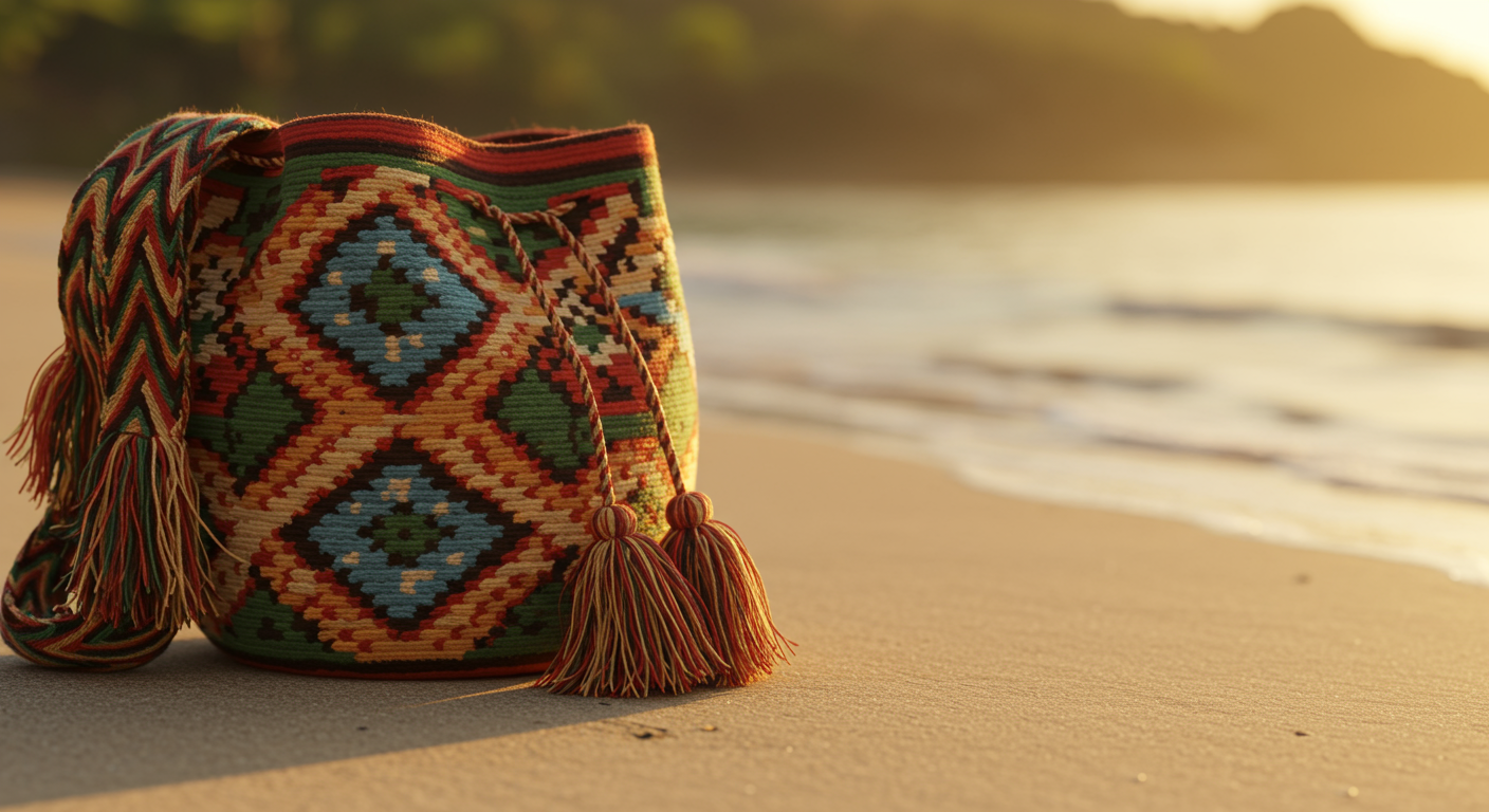
Colombian artisans have long understood that color affects our physical and emotional well-being. In traditional Colombian textile work, specific color combinations were chosen for their therapeutic properties. Warm yellows and oranges were believed to support digestive health and boost energy, while deep blues and greens promoted restful sleep and emotional balance.
When selecting swimwear, these principles become particularly relevant because you wear these pieces during moments of relaxation, exercise, and recovery. The colors closest to your skin during these vulnerable times can either support your wellness goals or work against them. For busy professionals managing stress, hormonal changes, and the demands of career and family, this color consciousness becomes a simple yet powerful tool for self-care.
The Science Behind Color and Mood
Research confirms what Colombian artisans have known for centuries. Blue tones can lower blood pressure and reduce anxiety, making them ideal for stress management. Red and coral stimulate circulation and energy production, perfect for days when you need motivation for exercise or recovery. Green promotes balance and supports the nervous system, particularly beneficial during hormonal fluctuations.
These effects become amplified when you spend extended time in swimwear during beach vacations, pool therapy sessions, or outdoor activities. Your choice of print can subtly support your body's natural healing processes and emotional regulation throughout these experiences.
Energizing Prints for Motivation and Vitality
When you need to boost energy levels or push through workout plateaus, warm-toned prints become your wellness allies. Coral, orange, and warm yellow patterns stimulate the sympathetic nervous system in healthy ways, promoting alertness and physical motivation without the crash associated with caffeine.
Our vibrant Colombian-inspired florals in coral and gold tones work particularly well for morning beach walks, water aerobics, or any activity where you want to feel energized and confident. These colors support healthy cortisol rhythms, helping you feel naturally alert during appropriate times of day while supporting better sleep patterns at night.
Best Times to Choose Energizing Colors
Select warm, vibrant prints during the first half of your day or when you need motivation for physical activity. These colors work especially well if you're recovering from illness or procedure and need gentle encouragement to return to movement. The visual stimulation supports your body's natural energy production without overwhelming your system.
For women experiencing perimenopause fatigue, energizing prints can provide psychological support for maintaining exercise routines and active lifestyles. The colors work with your body's changing hormone patterns rather than fighting against them.
Calming Prints for Stress Relief and Recovery
Blue and green tones offer powerful support for stress management and recovery periods. These colors activate the parasympathetic nervous system, promoting the rest-and-digest response that supports healing, hormone regulation, and emotional balance.
Our ocean-inspired prints in various shades of blue and teal provide visual calm that supports your body's natural relaxation response. When worn during beach meditation, gentle swimming, or post-procedure recovery time, these colors can enhance the therapeutic benefits of your activities.
Supporting Hormonal Balance Through Color
During perimenopause and menopause, your nervous system becomes more sensitive to environmental stimuli. Calming blue and green prints can provide visual support for managing mood swings, sleep disruptions, and anxiety. These colors work particularly well for evening beach walks or poolside relaxation when you want to prepare your body for restful sleep.
The cooling effect of blue tones can also provide psychological relief during hot flashes, while green promotes the sense of balance and stability that hormonal fluctuations can disrupt.
Grounding Prints for Emotional Stability
Earth tones including warm browns, deep greens, and muted oranges provide emotional grounding during times of transition or stress. These colors connect you to natural rhythms and support feelings of stability and security.
Colombian earth-tone patterns work beautifully for women managing career transitions, family changes, or health challenges. The colors provide subtle psychological support for feeling centered and capable while dealing with life's complexities.
Supporting Breast Health and Body Confidence
For women with fuller busts or those recovering from breast procedures, grounding colors can provide emotional support during vulnerable periods. Earth tones promote self-acceptance and body confidence without the intensity of brighter colors that might feel overwhelming during recovery.
These prints work particularly well in our supportive, reconfigurable designs that accommodate changing body needs while maintaining elegance and comfort.
Choosing Prints for Specific Life Phases
Your color needs change with your life circumstances, health status, and emotional state. Understanding how to match prints to your current phase supports your overall wellness strategy.
Active Recovery Periods
During post-surgical recovery or illness recuperation, choose prints that support your healing goals. Soft blues and greens promote rest and cellular repair, while gentle coral tones can provide motivation for prescribed movement and therapy exercises.
The key is selecting colors that feel supportive rather than demanding. Your swimwear should encourage gentle progress without adding visual stress to your recovery process.
High-Stress Career Phases
When work demands are particularly intense, your vacation and leisure time becomes crucial for nervous system recovery. Choose prints that actively counterbalance your work environment. If you spend days under fluorescent lights making high-stakes decisions, ocean blues and forest greens can provide the visual rest your system craves.
These calming prints support your body's ability to shift from work mode to relaxation mode, making your beach time more therapeutically effective.
Hormonal Transition Support
During perimenopause and menopause, your color sensitivity may change along with other sensory shifts. Pay attention to which colors feel soothing versus overwhelming. Many women find that they gravitate toward different color families during this transition, and honoring these preferences supports emotional well-being.
Grounding earth tones often feel particularly supportive during hormonal fluctuations, providing visual stability when internal systems feel unpredictable.
Practical Application: Building Your Color-Conscious Swimwear Collection
Create a swimwear wardrobe that supports your various moods and wellness goals. Consider having options for different emotional and physical states rather than choosing based solely on aesthetic preferences.
Start with one piece in each color family: an energizing warm-toned print, a calming blue or green option, and a grounding earth-tone design. This gives you color tools for different situations and moods throughout your year.
Seasonal Color Considerations
Your color needs may shift with seasons and natural light changes. Bright, energizing prints often feel most supportive during shorter winter days when you need motivation and mood lifting. Calming blues and greens provide relief during intense summer heat and longer daylight hours.
Pay attention to how different prints affect your energy and mood during various seasons, and adjust your choices accordingly.
The Wellness Benefits of Mindful Color Selection
When you choose swimwear colors based on mood and wellness goals, you create a daily practice of self-awareness and self-care. This mindful approach to getting dressed supports your overall health strategy and honors your body's changing needs.
The simple act of selecting colors that support your current state creates a moment of intention-setting that can enhance the therapeutic benefits of your beach time, pool workouts, or recovery periods. This practice costs nothing but adds significant value to your wellness routine.
Your swimwear becomes more than clothing when chosen with color consciousness. Each piece becomes a tool for supporting your emotional and physical well-being, connecting you to Colombian wisdom about the healing power of color while honoring your modern understanding of mind-body wellness. By building a collection that serves your various moods and life phases, you create a wardrobe that truly supports your health goals and celebrates your sophisticated approach to self-care. The colors you choose reflect your commitment to treating yourself with the same care and attention you provide to others in your professional and personal life.
